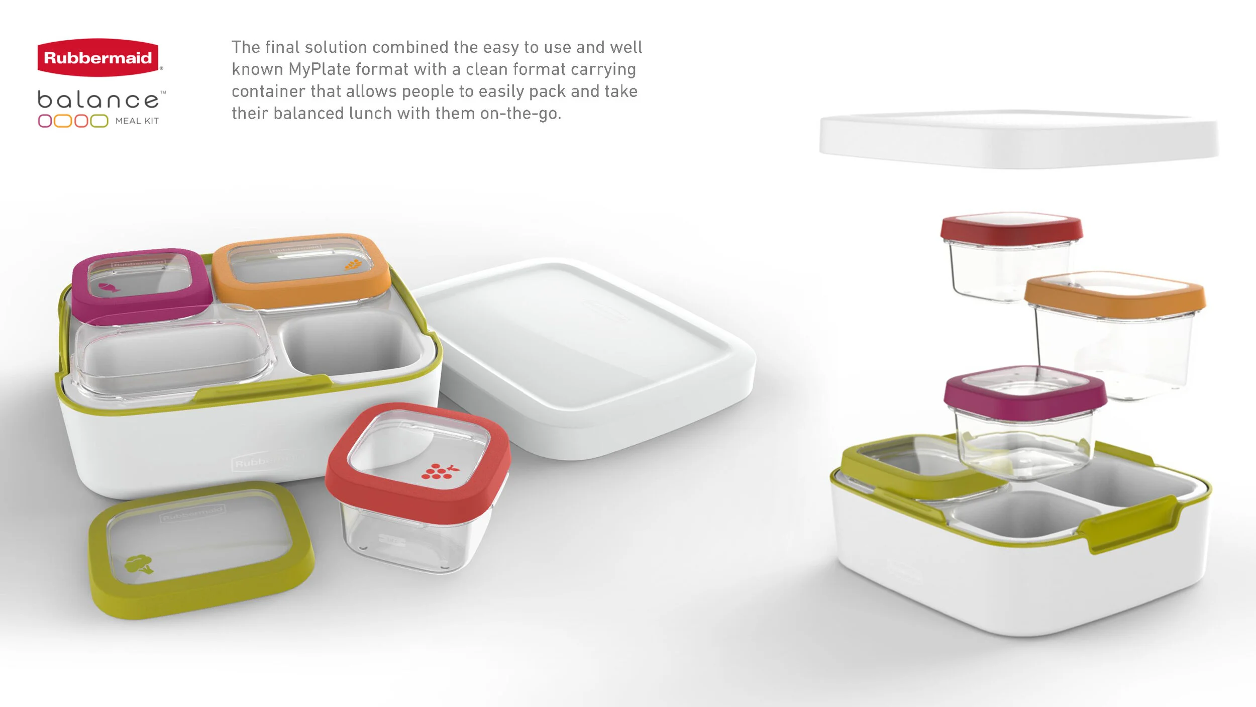
Rubbermaid Balance
Launched in 2017. The goal was to create a hassle free way to eat a well balanced meal On-the-go without measuring. I was the project lead while collaborating with additional ID, engineering, and graphics team members, with the guidance of nutritionist input to bring to market Rubbermaid Balance.
(All Photography/Digital Media credit to Newell Brands Photography/Digital Design/Graphics team)

We created a range of form concepts that still felt like they would be an appropriate aesthetic for the Rubbermaid consume.
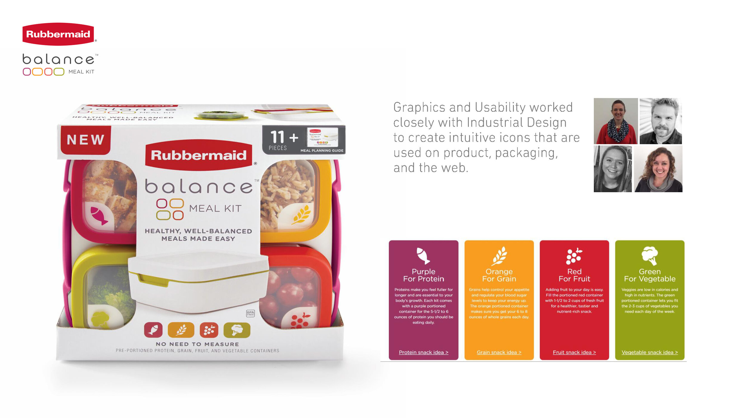
It was really important that the product design and graphic design complemented each other. The graphics team developed ions to help the user navigate the meal kit, as well as an informational recipe booklet. The UX team helped us evaluate throughout the process to make sure iconography was easily understandable. The icons were placed on the product itself, as well as on pack.


